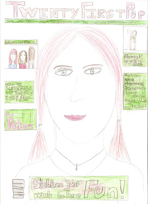
For my front cover I have used three main colours pink, brown and green. I used these colours because in my opinion these colours represent the genre of pop and they look fun and interesting and they will catch the readers attention. I have placed the main sell line at the bottom of the page so it doesn't drag attention away from the masthead. I have also placed three other sell lines and two other images in order to make the front page more interesting but to also make sure the front page is not to overcrowded.
For my contents page I have placed the masthead at the top of the page to make it familiar to the reader. I have also used the three main colours again. There is a image in the middle of the page. To the left of the image is a band index which states the name of all the bands featured in the magazine. Below the image is the table of contetns which is writtenin brown with the page number in pink to make it stand out more.
For the double page spread I have placed the artists name in the top righ corner to make i stand out more. Underneath the title will be a paragraph describing what is in the magazine. The there is going to be three colomns which will be the article. I have decided my article will be written in the form of a interview. In the centre will be the main image which will be the biggest. Then below will be two rows of three smaller images. This will show different aspects of the artists life. In the top right corner will be a box that details interesting information about the artist that the reader probabley didn't already know.


No comments:
Post a Comment